Dice & Dumplings
Turning a complex trading-card catalogue into a scalable shopping experience
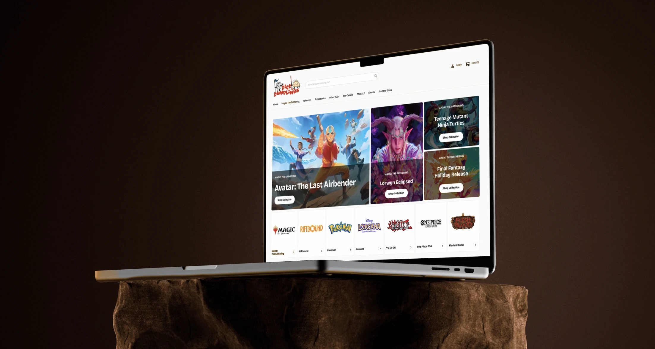
An e-commerce redesign focused on helping customers navigate a large, frequently changing catalogue across multiple trading-card games, product formats, releases and promotions.
Role
UX/UI Designer and Shopify Developer
Tools
Figma, Shopify and Adobe Creative Cloud
YEAR
2026
CHALLENGE
Dice & Dumplings had a large, fast-changing catalogue, but products were difficult to explore across games, sets and formats. The previous platform also created fulfilment issues and provided no clear route from discovery to purchase.
solution
A flexible shopping system built for layered discovery
I reorganised the experience around the primary ways customers shop for trading-card products:
Searching directly for a known item
Discovering new releases
Browsing by game
Shopping by product format
The redesign combined prominent search, game-specific navigation, structured collection pages and reusable catalogue and promotional components,
This created a clearer path from broad catalogue discovery to a focused product list, while preserving fast access for customers who already knew what they wanted.
STAKEHOLDEr interview
What Dice & Dumplings needed from the redesign
Across the initial stakeholder sessions, I worked with the founders to separate the immediate ecommerce requirements from their longer-term vision for a connected retail ecosystem.
The Square website supported basic pre-orders, but fulfilment was difficult to manage and stock was allocated manually between the website, Cardmarket and the physical store. The new storefront needed to work effectively now while remaining flexible enough to support future products, channels and integrations.
We need a better foundation that could grow with the business, rather than rebuilding the website every time we introduced a new product type or feature.

Key business needs:
Improve online ordering and fulfilment
Reduce manual stock allocation
Support sealed products and pre-orders
Preserve Square for in-store point-of-sale
Improve catalogue discovery and SEO
Create a scalable ecommerce foundation
Customer interviews
Understanding how different customers approached the catalogue
I held informal in-person conversations with 10 customers, including experienced players, collectors and occasional buyers.
The conversations explored:
Whether customers began with a specific game, set or product
How they distinguished between product formats
When they used search instead of navigation
How they discovered new releases
What made a collection page useful
How online shopping related to visits to the physical store
Direct shopper
Knows the product, set or release required and expects to find it quickly through search.
Core question:
Can I reach the exact product quickly?
Game-focused browser
Begins with a preferred game but may still be deciding between sets or product formats.
Core question:
What is available for the game I already play?
Release-driven collector
Responds to new launches, pre-orders, limited editions and promotional campaigns.
Core question:
What is new, upcoming or difficult to find?
Needs-based shopper
Starts with a practical requirement such as sleeves, storage, deck boxes or playmats.
Core question:
Which type of accessory suits what I need?
COMPETITOR ANALYSIS
Finding Where Dice & Dumplings Could Stand Apart
I reviewed four established TCG retailers to compare their catalogue structure, product discovery, catalogue presentation and promotional patterns.
Chaos Cards

Does well
Strong filtering and promotional patterns.
GAP
Campaigns compete with permanent discovery routes.
IMPLICATION FOR Dice & Dumplings
Separate promo from core navigation.
Magic Madhouse

Does well
Extensive catalogue depth and category authority.
GAP
Dense experience for less-directed shoppers.
IMPLICATION FOR Dice & Dumplings
Reveal the catalogue progressively.
Card Vault

Does well
Clean interface with strong product imagery.
GAP
Navigation may become strained as the range grows.
IMPLICATION FOR Dice & Dumplings
Let products lead within a clean UI.
Game Island

Does well
Clear categorisation by product type.
GAP
Less useful for game- or release-led browsing.
IMPLICATION FOR Dice & Dumplings
Support game, set and format routes.
SYNTHESIS
What the research established
The stakeholder, customer and competitor research resulted in five principles for the redesign.
01. Preserve what already works
Improve the ecommerce experience without replacing the in-store POS workflow solely for technical uniformity.
02. Support different levels of intent
Give direct shoppers fast search access while providing guided routes for customers who are still exploring.
03. Reveal catalogue progressively
Move customers from: Game → Set → Product rather than presenting the entire range at once.
04. Separate stable from temporary
Keep games, product types and store services consistently available while allowing releases and promotions to change frequently.
05. Design for operational growth
Create reusable structures that the team can maintain as products, releases and categories expand.
STRATEGY
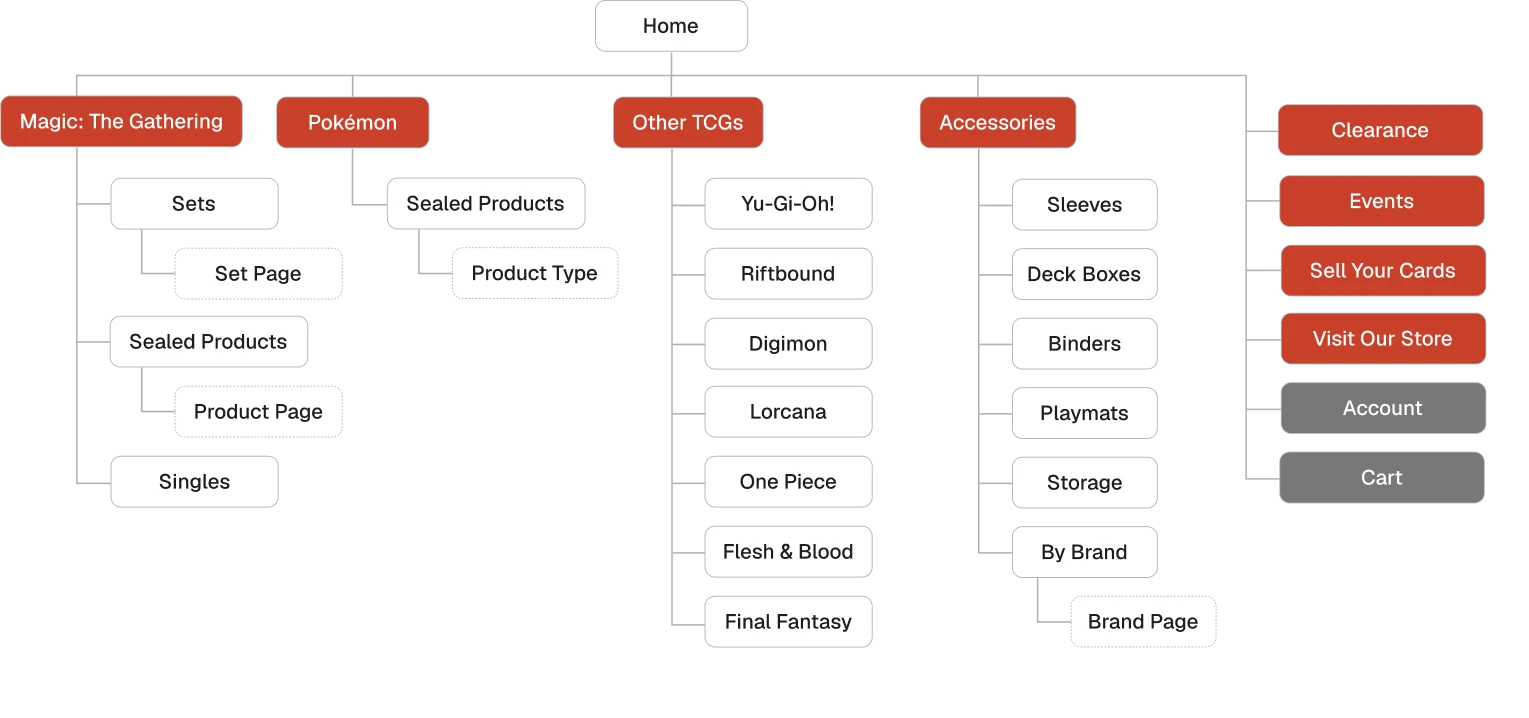
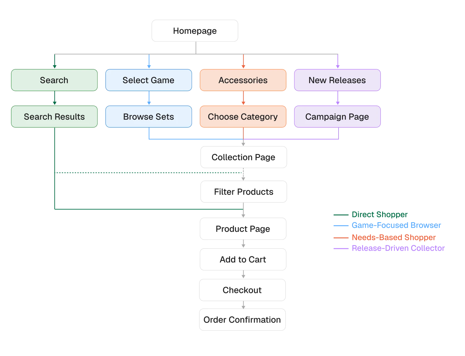
Designing multiple routes into one catalogue
The research showed that customers could approach the same inventory through different mental models.
The experience was therefore structured around multiple entry points rather than one prescribed funnel.
Simplified Information Architecture
User Flow
DESIGN DIRECTION
Building A Playful Visual System Around The Existing Brand
Dice & Dumplings already had a distinctive illustrated logo that reflected the playful character of the store.
I retained and lightly refined the logo, then built a consistent interface palette around its existing colours.
Bricolage Grotesque complemented the hand-drawn identity while providing a clearer contemporary type system for navigation, product content and promotional sections.
Logo

Colour Palette


FINAL DESIGN
Turning A Complex Catalogue Into A Clearer Shopping Journey
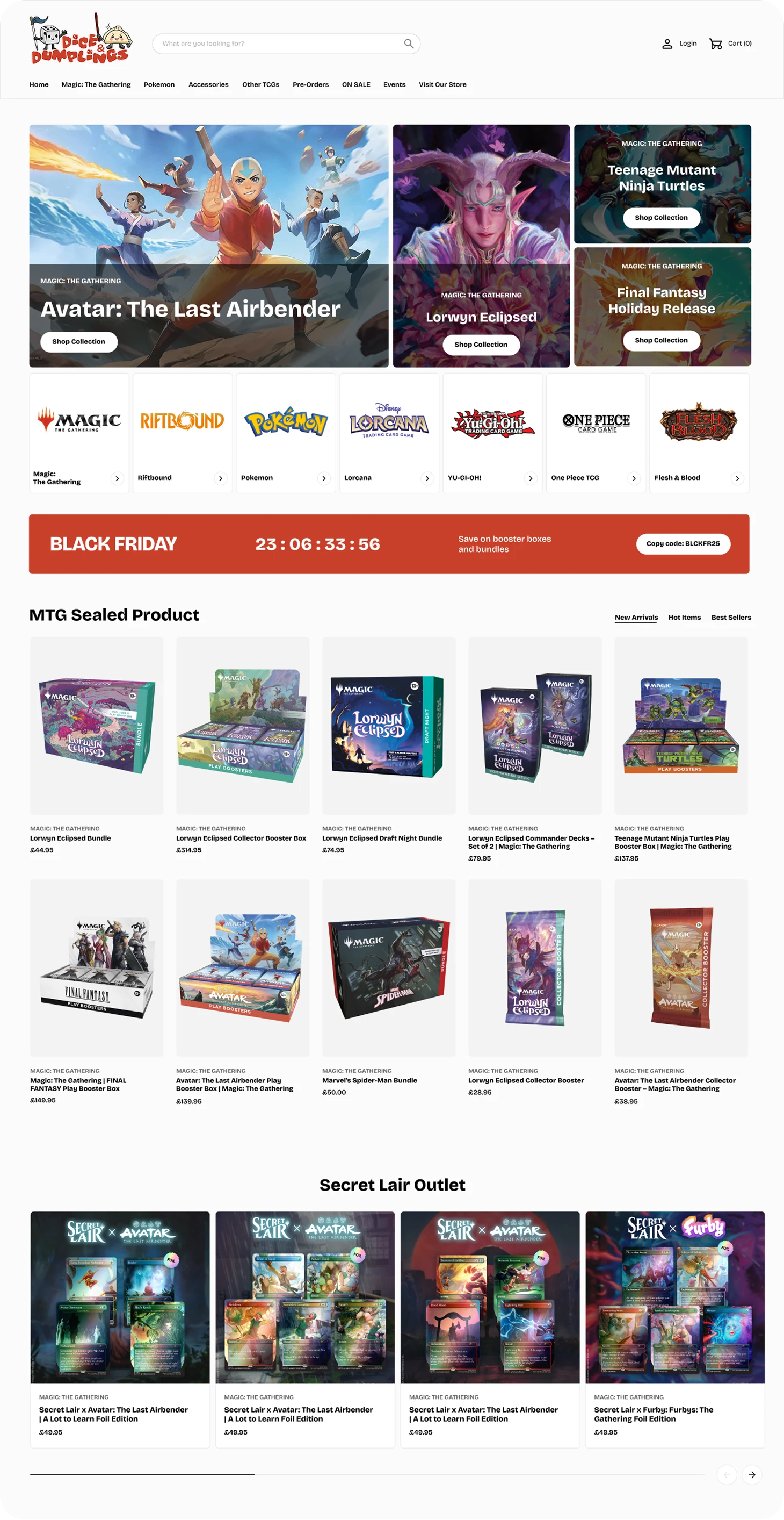
The final experience connected search, catalogue discovery, product evaluation and purchase within one structured ecommerce system.
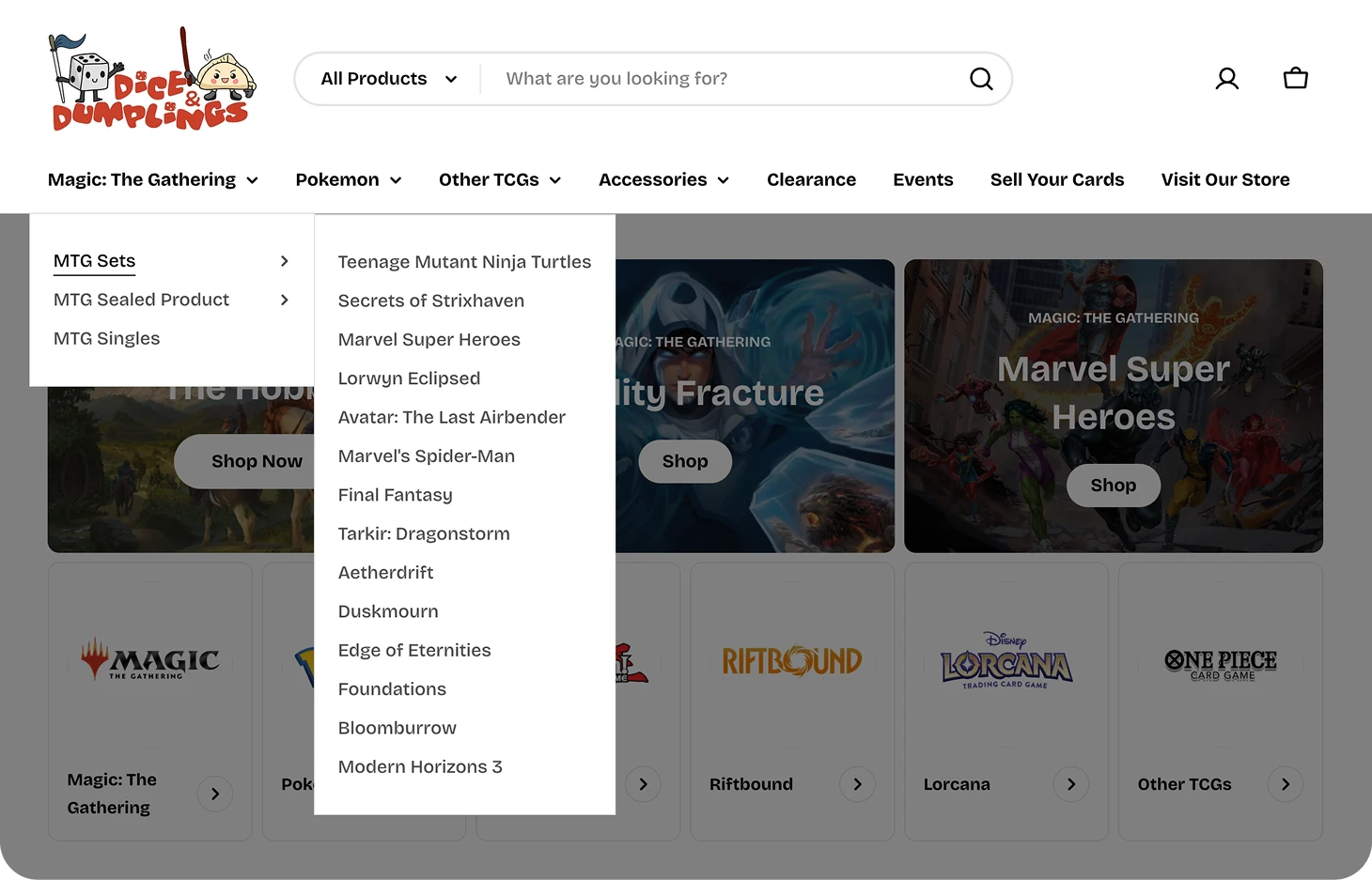
01. Combining Direct Search With Layered Browsing
Search remained prominent for customers who knew what they wanted, while the navigation supported browsing by game, set and product type.
The mega menu separated stable categories from changing releases, making a deep catalogue easier to scan.
02. Helping Customers Narrow The Catalogue
Collection pages introduced relevant sets, formats and accessory categories before the product grid.
This allowed customers to begin with a familiar game, release or practical need rather than scanning the full catalogue immediately.
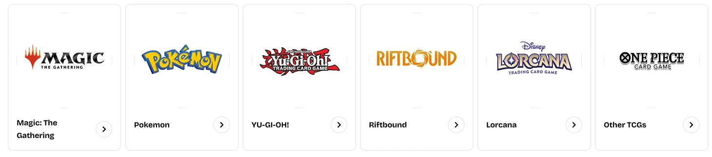
Browse by game
Game cards gave customers a fast route into the catalogue they already recognised.
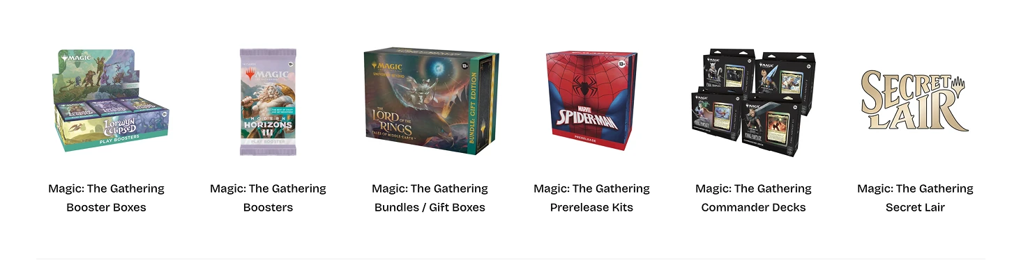
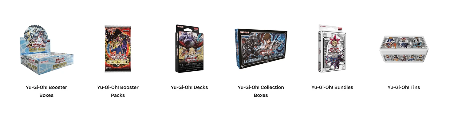
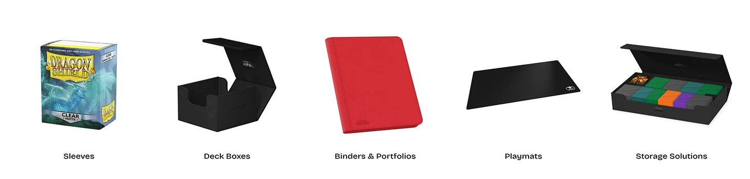
Browse by product type
Format categories helped customers find booster boxes, decks, bundles and accessories without choosing a specific release first.
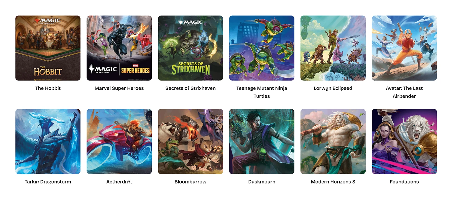
Browse by set/Release
Artwork-led set cards supported customers who began with a familiar launch or franchise.
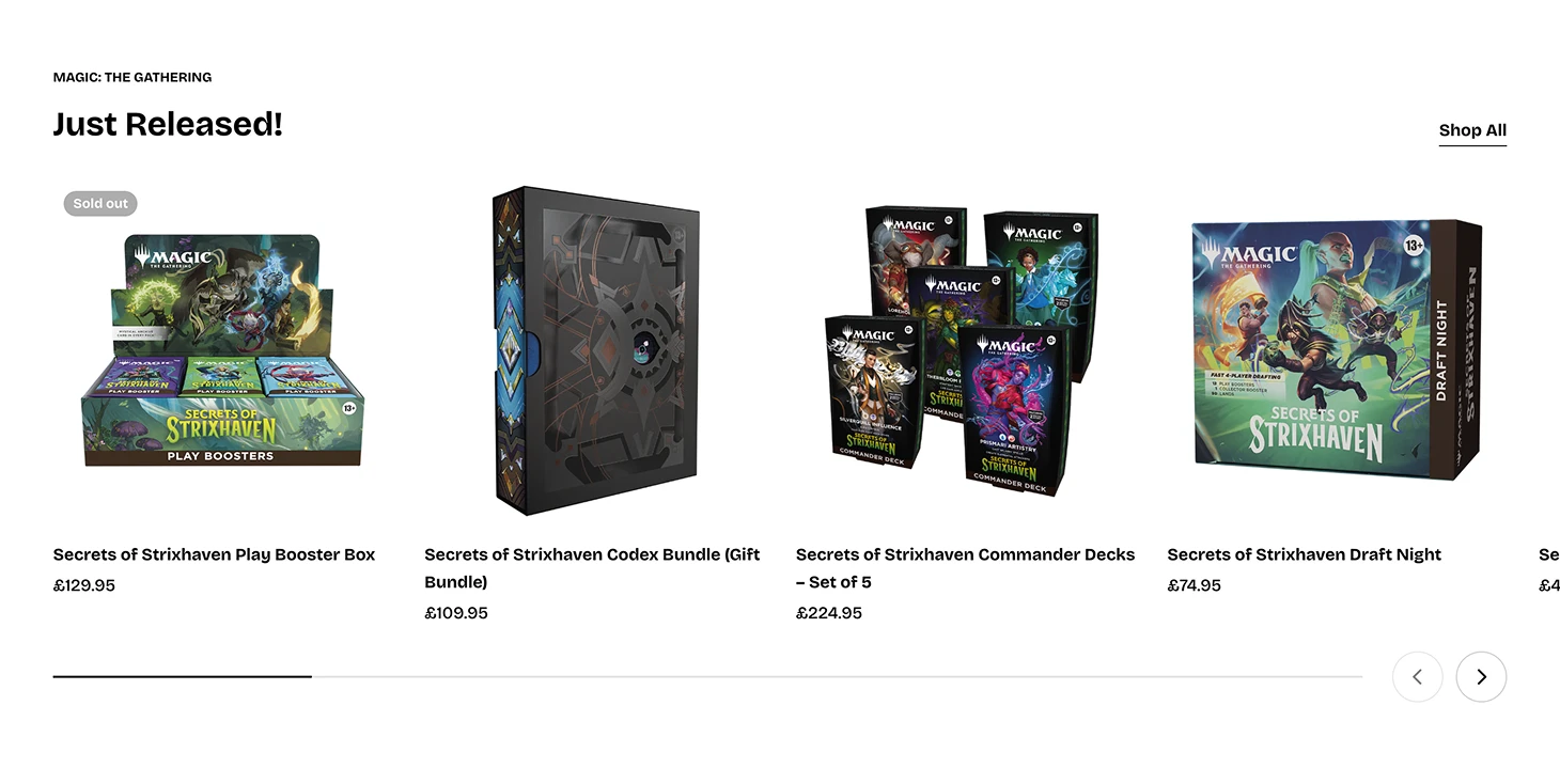
03. Keeping new releases visible
Reusable product sections gave new releases and featured ranges clear visibility without changing the permanent catalogue structure.
The team could update these sections as launches, availability and priorities changed.
04. Building confidence around the purchase
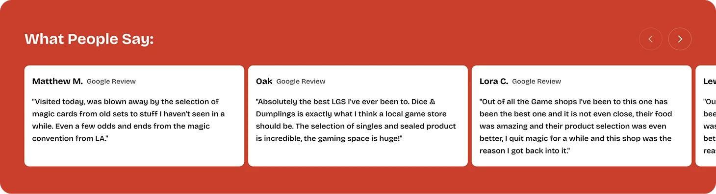
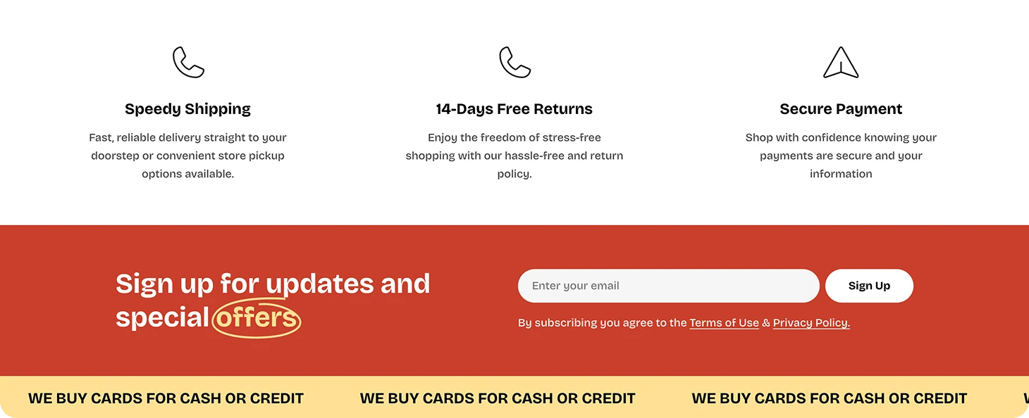
Customer reviews brought the physical store’s reputation into the online experience, while delivery, returns and payment information answered practical concerns before checkout.
Email sign-up and card-buying messaging also created routes for customers who were not ready to purchase immediately.
IMPLEMENTATION
Building A Flexible Shopify Storefront
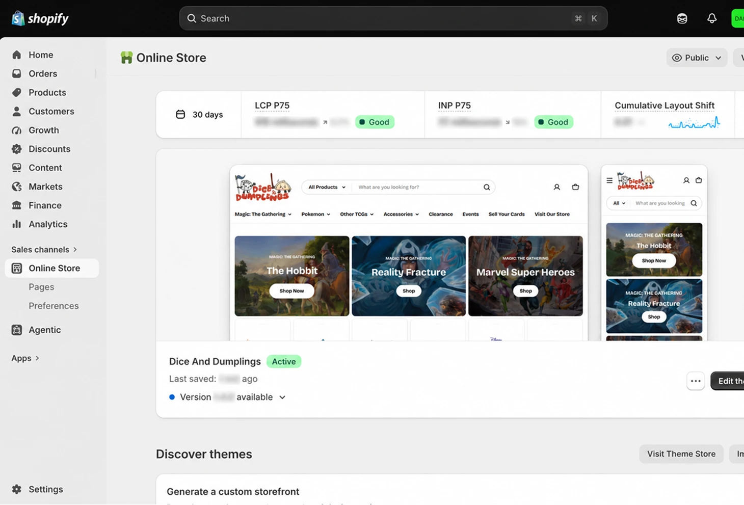
I translated the approved experience into reusable Shopify sections and collection templates, allowing the team to update products, releases and homepage content without changing the underlying structure.
The build included responsive layouts, configurable product sections, collection filtering, product states and reusable content modules.
REVIEW & QA
Refining the experience before launch
The website was reviewed with Dice & Dumplings’ stakeholders to confirm that the catalogue structure, product terminology, promotional content and store information accurately reflected the business.
Before launch, I tested the experience across breakpoints and browsers, focusing on navigation, filtering, product states, readability and checkout usability.
Stakeholder Review
Verified catalogue structure, product terminology and store information.
Responsive QA
Reviewed layouts across desktop, tablet and mobile.
Accessibility Checks
Checked contrast, heading structure, focus states and alternative text.
Functional Testing
Tested navigation, search, filters, forms, basket and checkout routes.
RESULT
Strong Early Performance After Launch
The redesigned store supported stronger purchase conversion, repeat customer activity and online order volume during its first months after launch.
*Comparison based on equivalent reporting periods across Square and Shopify.
+65%
Increase in conversion rate*
+76%
Increase in returning customer rate*
+94%
Increase in online orders*
“The new store gave us a much clearer way to organise products and releases, while making online orders easier for both customers and the team.”
SELECTED WORK
Other Case Studies

OPEN TO UX/UI OPPORTUNITIES