RVNU
Turning a complex GTM methodology into a clear path to predictable growth
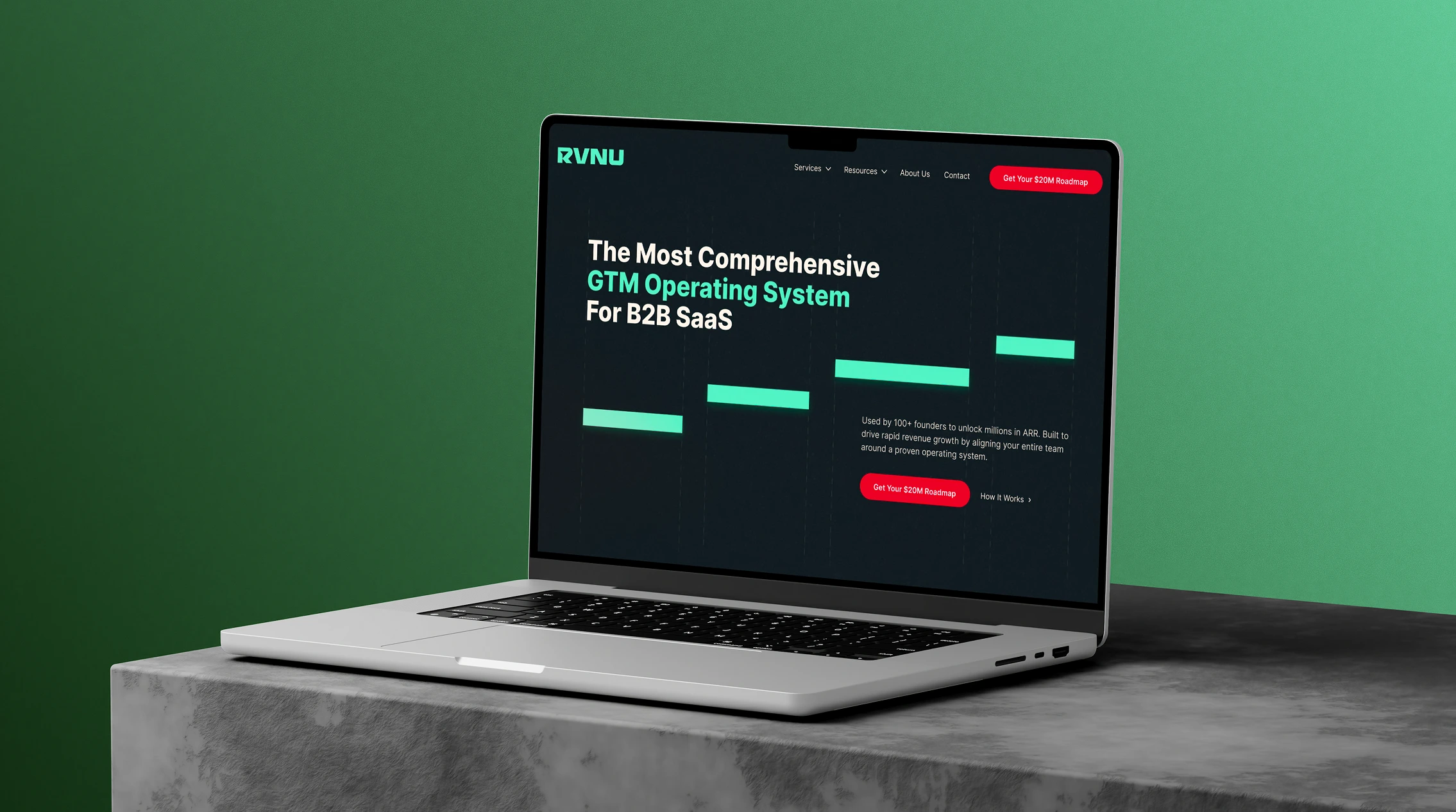
A website strategy, UX/UI redesign and Webflow build focused on making RVNU’s operating system easier to understand and creating a clearer path to its core diagnostic offer.
Role
UX/UI Designer and Webflow Developer
Tools
Figma, Webflow and Adobe Creative Cloud
YEAR
2025
CHALLENGE
RVNU had a distinctive identity and strong strategic content, but its methodology felt abstract, its offers were difficult to connect and the next step was unclear.
solution
A System-Led Experience Built for Clearer Evaluation
I reorganised the website around the problems founders recognised, then progressively introduced RVNU’s methodology, evidence and offers.
I also created a consistent visual language for its proprietary frameworks, established one primary conversion route and designed reusable components for future content & campaigns.

Research
Understanding How B2B SaaS Founders Evaluate GTM Support
To understand what prospective clients needed before engaging with RVNU, I combined an audit of the existing website with stakeholder discovery, audience analysis and a review of reference websites.
The research focused on explaining a complex GTM system without overwhelming visitors or reducing it to generic consulting language.
Website audit: Before the redesign
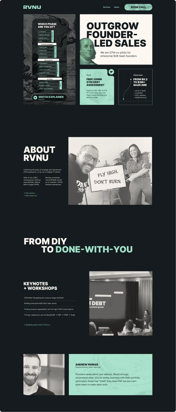
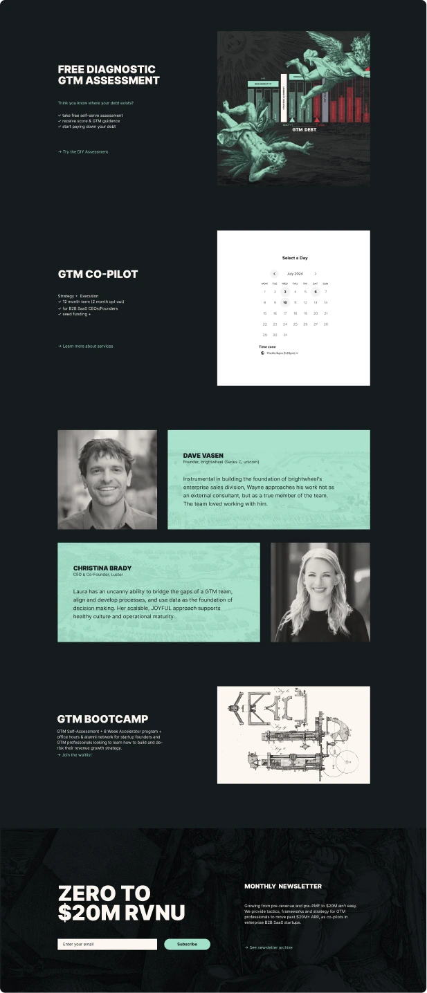
The existing site had a strong visual identity and substantial strategic thinking, but its structure made the proposition difficult to interpret.
The client described the experience as lacking an obvious customer journey, feeling heavily brand-led and abstract, and being difficult for the internal team to edit.
The proposition was difficult to understand quickly
Expressive language and visual concepts appeared before a concise explanation of what RVNU offered.
The methodology felt abstract
Proprietary frameworks were visible, but their connection to a founder’s immediate problems was not always clear.
The offer hierarchy was unclear
The Roadmap, services, community and content existed within one ecosystem, but their relationship was difficult to scan.
The next action was inconsistent
Competing offers and actions weakened the primary route to the $20M Roadmap.
STAKEHOLDEr interview
What RVNU Needed From the Redesign
I used a stakeholder questionnaire and collaborative working sessions to clarify RVNU’s positioning, audience, commercial model and internal requirements.
RVNU wanted to replace outdated, high-risk GTM approaches with a structured system for more predictable and measurable growth.
The website needed to reflect the sophistication of the instruments while making the product range easier to understand.

Key business needs:
Explain the GTM operating system clearly
Make "Roadmap" the primary conversion route
Connect content & services into one ecosystem
Make proprietary frameworks easier to digest
Support different levels of buyer readiness
Create a self-service website they could scale
Audience Analysis
Two Evaluation Modes: One Growth Decision
RVNU’s audience consisted mainly of ambitious B2B SaaS founders and CEOs, often technical founders at seed or Series A moving beyond founder-led sales or professionalising their GTM operation.
Although they shared the same growth decision, they approached the website in two different evaluation modes.
Founder Diagnosing the Problem
Primary goal: Understand why growth is becoming less predictable.
Recognisable explanations of GTM constraints
A way to identify their current growth stage
Visual frameworks that simplified concepts
A low-commitment route into methodology
Decision question:
Does RVNU understand what is holding our growth back?
Founder Evaluating RVNU
Primary goal: Decide whether RVNU is a credible strategic and operational partner.
A clear explanation of the operating system
Evidence from relevant companies & founders
A visible relationship between different offers
Specific outcomes and a credible next step
Decision question:
Can RVNU help us build a more predictable growth system?
COMPETITOR ANALYSIS
Finding Where RVNU Could Stand Apart
I reviewed three close competitors selected for their overlap with RVNU’s audience and service model: B2B SaaS companies moving beyond founder-led sales, proprietary GTM frameworks, diagnostic offers and hands-on advisory support.
Rocklane Strategy

Does well
Connects specific founder problems to frameworks and measurable outcomes.
GAP
Multiple tools, resources and service routes compete as starting points.
Implication for RVNU
Keep the $20M Roadmap visibly dominant.
Revenue Reimagined

Does well
Clearly differentiates embedded execution from traditional consulting.
GAP
Forceful language and dense branded terminology may weaken its considered tone.
Implication for RVNU
Demonstrate operator credibility through clarity rather than pressure.
GTM Partners

Does well
Builds strong authority through a proprietary operating system, research and assessments.
GAP
Its broad ecosystem creates a less focused journey for an individual founder.
Implication for RVNU
Tailor the framework around one founder-specific path.
SYNTHESIS
What the research revealed
Research findings clustered around four recurring needs. These became the organising principles for the redesigned experience.
1. Diagnose Before Prescribing
Surface the Growth Constraint
Start with recognisable founder problems.
Help Founders Locate Themselves
Use stages and assessments to support self-diagnosis.
Show the Commercial Consequence
Connect each problem to predictability and scale.
2. Show me the differences
Introduce the Complete Model
Position RVNU as an operating system, not isolated services.
Break Complexity into Stages
Reveal the methodology progressively.
Use Frameworks as Proof
Make proprietary thinking visible and understandable.
3. Design For Buyer Readiness
Provide Low-Commitment Entry
Support visitors through content, assessments and community.
Connect the Offers
Clarify how the Roadmap, services and resources fit together.
Separate Learning from Buying
Keep educational routes distinct from commercial actions.
4. Guide Visitors To The Roadmap
Create One Flagship Action
Make the "$20M Roadmap" the clearest next step.
Build Confidence Along the Way
Place proof around the questions founders need answered.
Use a Consistent Conversion Pattern
Repeat the same message and treatment across the journey.
STRATEGY
Designing one experience for different levels of buyer readiness
The research showed that visitors could arrive with very different levels of understanding.
Some would have encountered RVNU through a referral or direct recommendation. Others would have read an article, followed its social content or already encountered concepts such as GTM debt before reaching the website.
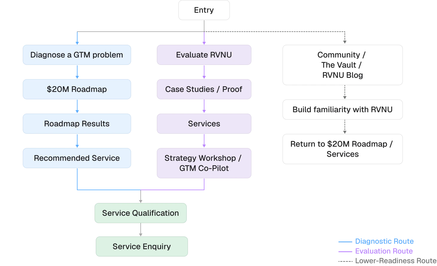
Rather than forcing every visitor immediately into a sales conversation, I structured the experience as a shared journey from orientation and diagnosis to evaluation and action.
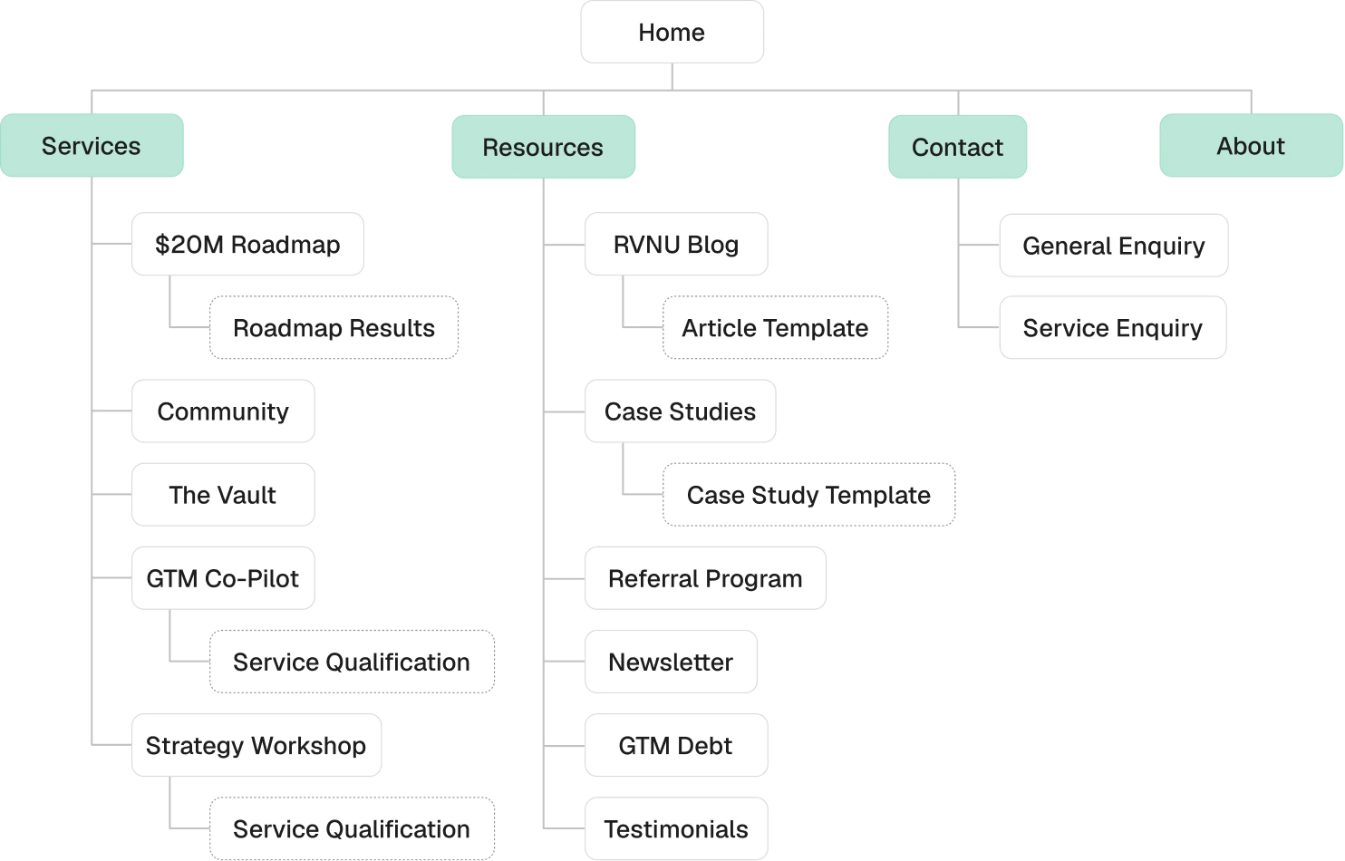
Simplified Sitemap
User Flow
WIREFRAMING
Testing the Narrative Before Design
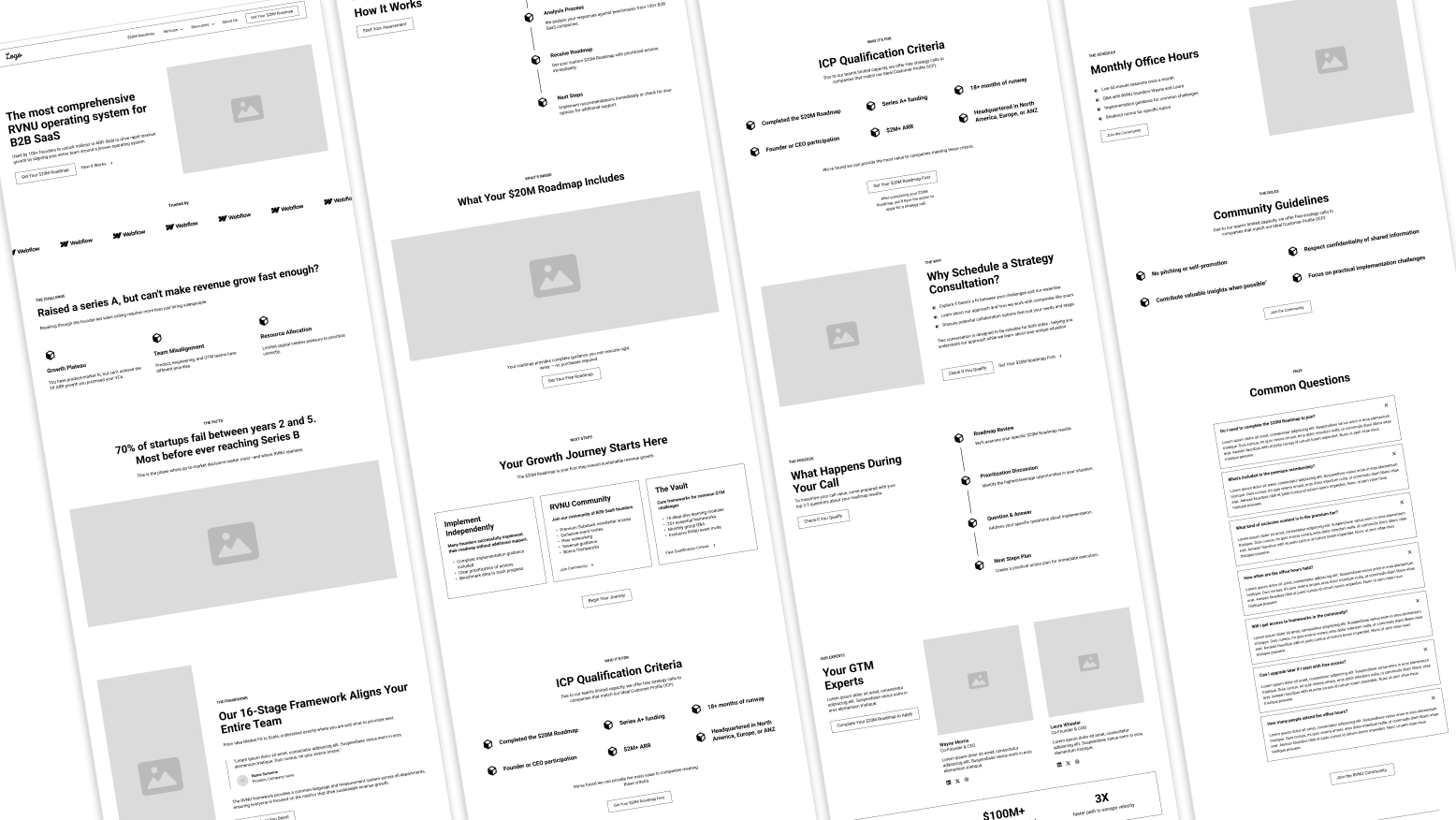
With the structure defined, I used wireframes to map the journey from RVNU’s proposition through evaluation, qualification and the Roadmap.
I focused on:
Clear category positioning
Progressive explanation of the system
Controlled conversion opportunities
Consistent offer structures
Evidence at key decision points
Modular layouts for longer content
Stakeholder feedback helped refine the page sequence and content hierarchy before visual design. The wireframes also revealed where diagrams could explain RVNU’s proprietary frameworks more effectively than copy.
DESIGN DIRECTION
Refining RVNU’s Existing Visual Language
RVNU already had a distinctive dark interface, bold typography and a visual language built around proprietary frameworks and archival imagery.
I refined these elements into a more consistent system that was easier to apply across the redesigned website.
Logo
Colour Palette


Component System
Creating Reusable Patterns Across the Website
The site was designed around reusable components rather than independent page layouts.
The library included:
Navigation and footer
Statistics and testimonials
Framework & offer cards
Buttons and supporting links
Logo groups
Calls to action
This created a more consistent experience and made the transition from Figma into Webflow more efficient.
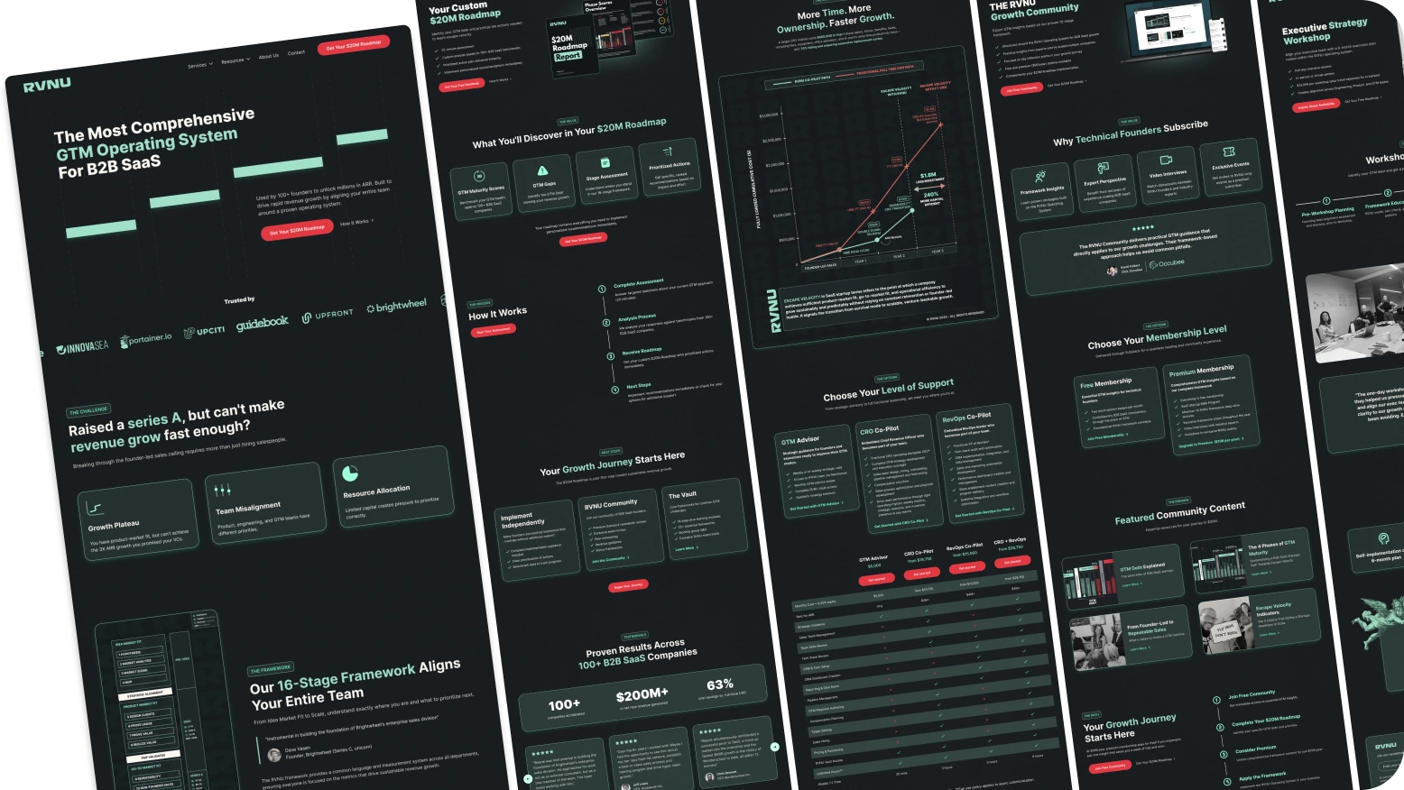
Visual Exploration
Refining the Hero Direction
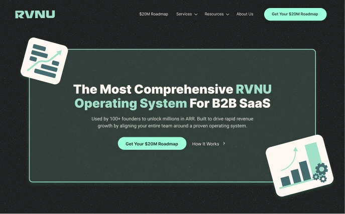
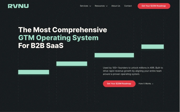
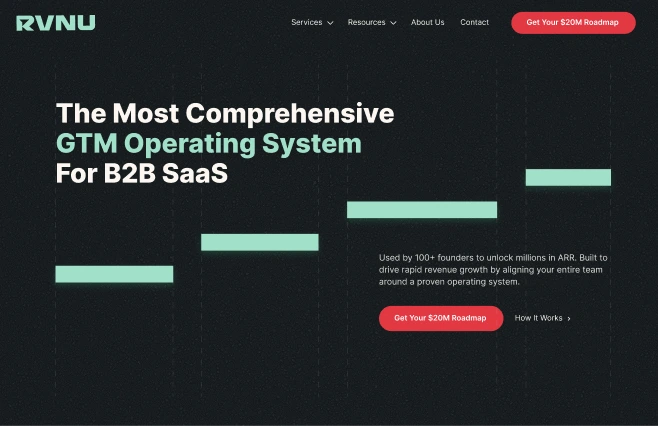
The homepage hero evolved into a cleaner composition that embedded the stages of RVNU’s framework directly into the design. This made the proposition feel more connected to the company’s methodology and gave the opening section a stronger sense of structure and progression.
The primary CTA also changed from mint to bright red, creating a clearer focal point and making the main conversion action easier to identify.
Initial Hero Design
Final Hero Design
FINAL DESIGN
Turning the Methodology Into a Clearer Growth Journey
The final interface connected positioning, diagnosis, evidence and conversion into one structured experience.
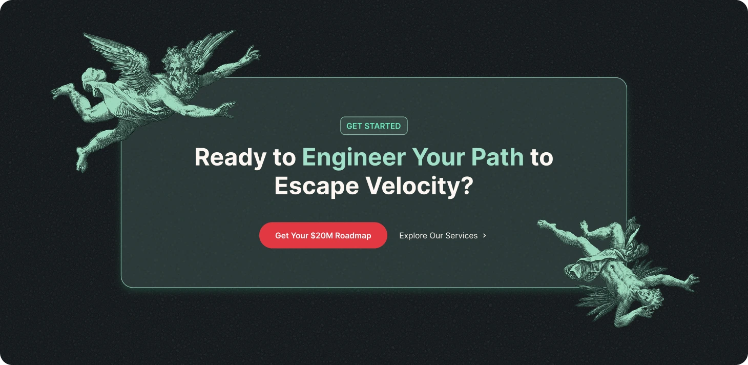
01. A Clearer Route to the $20M Roadmap
The $20M Roadmap became RVNU’s primary commercial action.
Consistent naming, button treatments and conversion sections made the next step recognisable across the homepage, service pages, frameworks and case studies.
The Roadmap page then explained the process, expected value and qualification requirements before directing visitors towards a conversation.
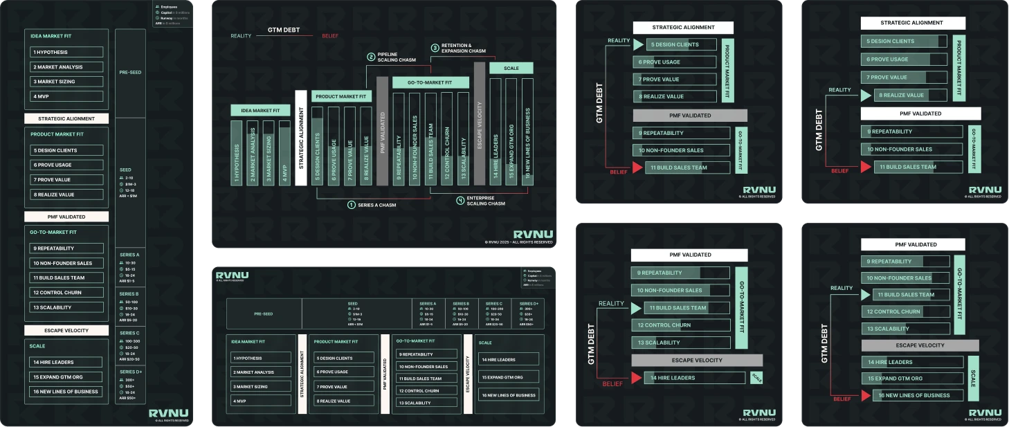
02. Making the Operating System Visible
Custom diagrams replaced long explanations of RVNU’s growth stages, constraints and diagnostic models.
This helped founders recognise their current problems while demonstrating the depth of RVNU’s methodology.
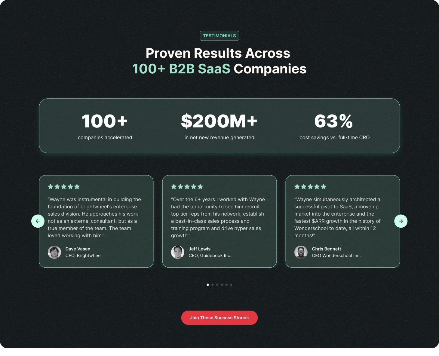
03. Connecting Offers With Proof
The services experience clarified how RVNU’s offers supported different needs and levels of buyer readiness.
Testimonials, client logos, statistics and case studies were placed around these offers so visitors could validate RVNU before progressing.
IMPLEMENTATION
Carrying the Design From Figma Into Webflow
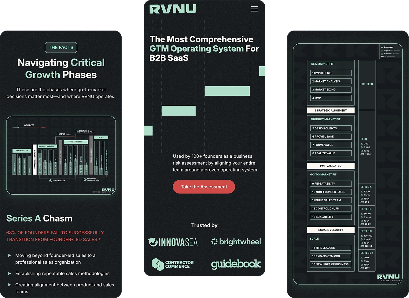
I built the responsive website in Webflow, translating the approved visual system into reusable production components.
Responsive layouts across desktop, tablet and mobile
Modular service, proof and CTA sections
Custom framework and data-visualisation assets
Scalable structures for case studies and longer content
Qualification and booking flows
Performance-conscious image handling
Development also allowed me to refine how information-dense sections adapted to smaller screens while preserving the intended hierarchy.
REVIEW & QA
Refining the experience before launch
The website was reviewed with RVNU’s stakeholders to confirm that its positioning, terminology, frameworks and offers accurately reflected the business.
Before launch, I also checked the experience across breakpoints and browsers, focusing on readability, interaction states, content hierarchy and form usability.
Stakeholder Review
Verified technical accuracy and product positioning.
Responsive QA
Reviewed layouts across desktop, tablet and mobile
Accessibility Checks
Checked contrast, readability, structure, focus states and alt text.
Functional Testing
Tested navigation, downloads, forms and demo routes.
RESULT
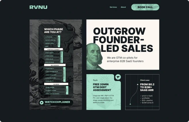
From an Abstract Brand Site to a Focused GTM Platform
The redesign gave RVNU a clearer and more scalable way to present its methodology to B2B SaaS founders.
The website became a structured interface for introducing RVNU’s operating system and guiding prospective clients towards the appropriate next step.
One recognisable route to the $20M Roadmap
Clearer category positioning
Visual explanations of proprietary frameworks
More deliberate use of proof
A reusable responsive system
Before
After
"Working with Alex has been fantastic. From the beginning, he outlined the process and steps both of us needed to take in order for him to deliver what we were looking for in our website re-build. He brought bestpractices in SEO, content design, coloring and helped guide us throughcritical decisions. His knowledge of the technical side combined withhis creativecuriosity delivered an exceptional website for us at RVNU."

SELECTED WORK
Other Case Studies
OPEN TO UX/UI OPPORTUNITIES