NIEKA SYSTEMS
Reframing complex fusion technology for global laboratory buyers
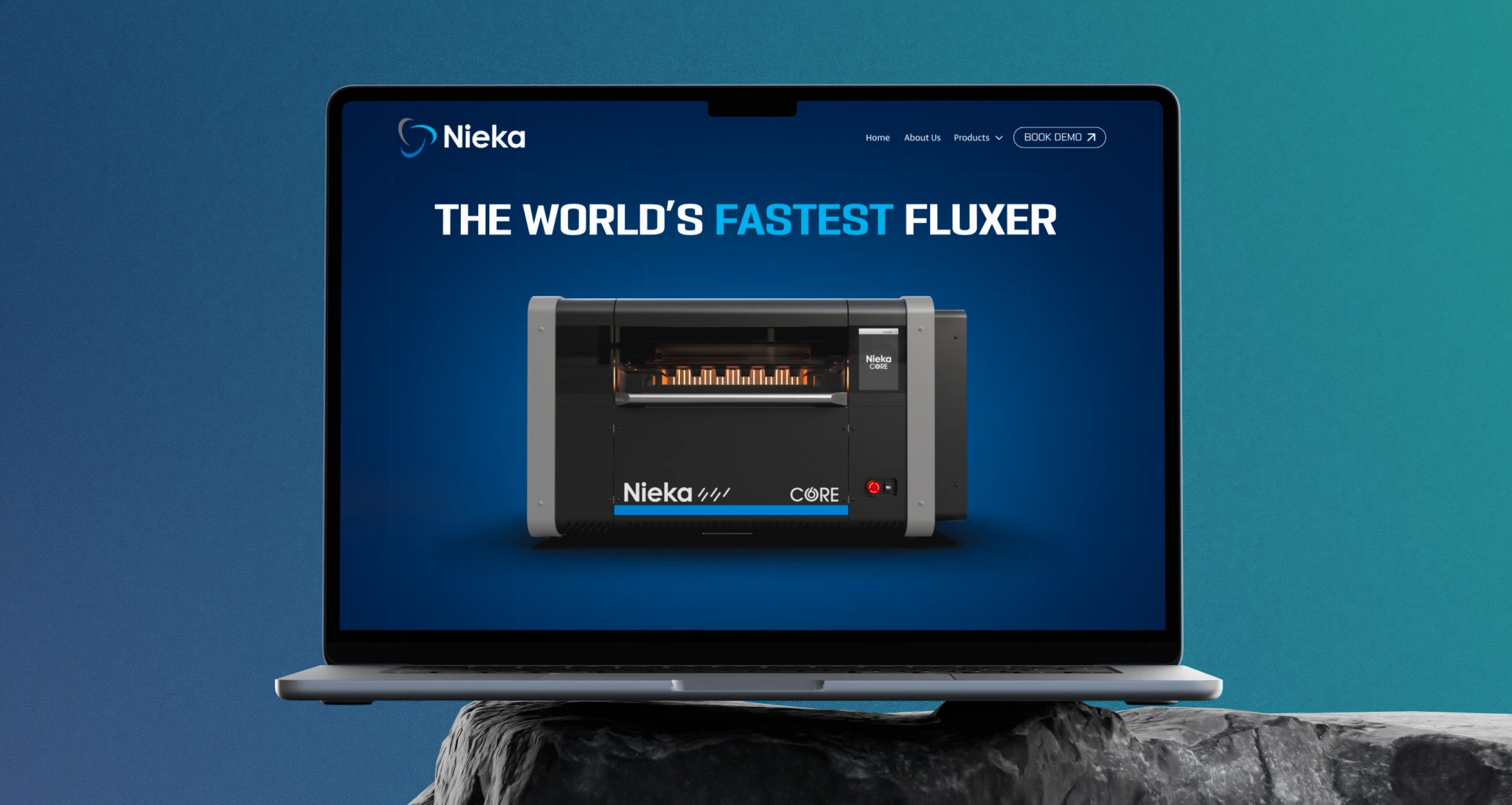
A website and brand redesign focused on clarifying Nieka’s instrument range and creating a clearer path from product discovery to demo.
Role
UX/UI Designer and Webflow Developer
Tools
Figma, Webflow and Adobe Creative Cloud
YEAR
2024
CHALLENGE
Nieka’s website contained valuable technical information, but the product range was difficult to compare, key benefits were hard to scan and inconsistent calls to action weakened the path to a demo.
solution
A product-led experience built for clearer evaluation
I reorganised the website around Nieka’s three instrument lines, introduced a consistent hierarchy across product pages, used visual callouts to explain complex engineering and created one recognisable route to product literature and demos.
Research
Understanding how buyers evaluate scientific equipment
To understand what buyers needed before progressing to a demo, I combined an audit of the existing website with stakeholder interviews, competitor analysis and short conversations with two groups involved in the purchase.
Website audit: Before the redesign
The existing website contained valuable product information, but its structure made the range difficult to compare, technical value hard to scan and the route to a demo inconsistent.
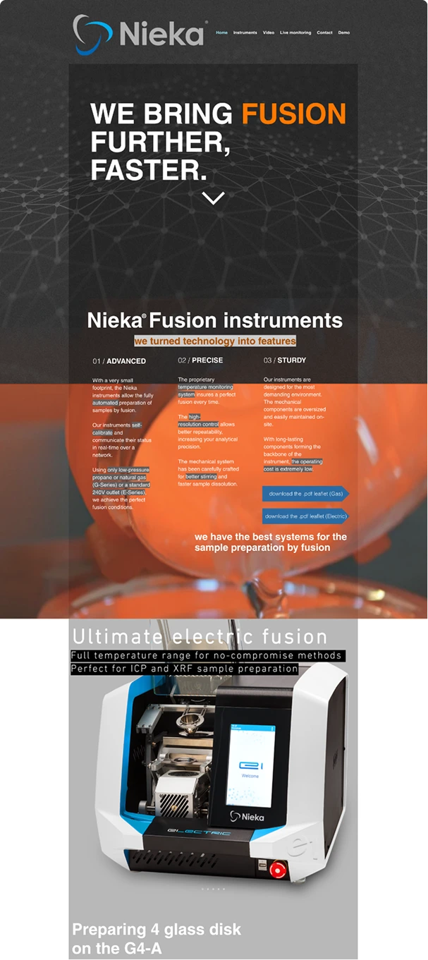
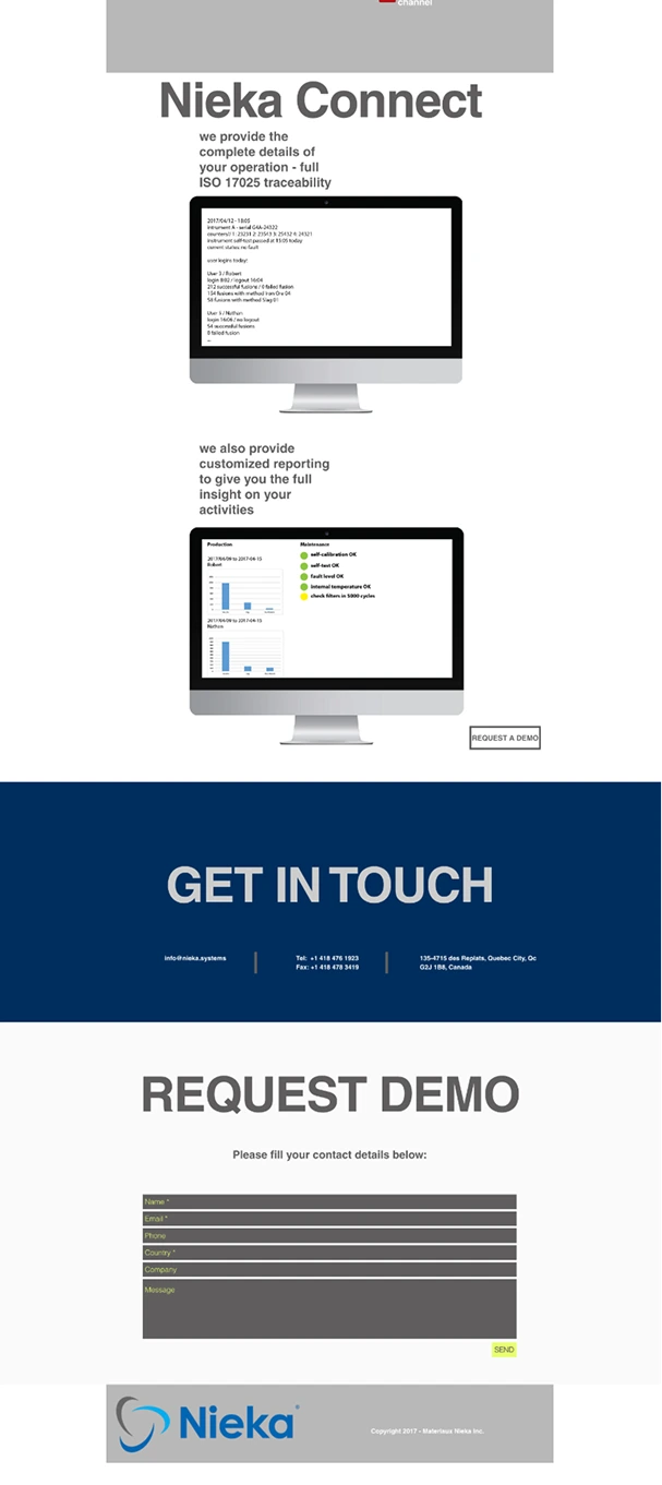
The product range was not clear
Buyers were not given a clear overview of the three instrument lines.
Technical content was hard to scan
Dense copy and weak hierarchy made key benefits easy to miss.
The primary action was inconsistent
Multiple CTA labels and layouts made the next step unclear.
STAKEHOLDEr interview
What Nieka Needed from the Redesign
I spoke with Nieka founder Louis Croisetiere to understand where the existing website was limiting product discovery, sales conversations and future growth.
The website needed to reflect the sophistication of the instruments while making the product range easier to understand.

Key business needs:
Clarify the three instrument lines
Communicate technical value clearly
Guide qualified buyers to a demo
Support future product launches
BUYER INTERVIEWS
Two user groups: One purchase decision
Technical researchers evaluate product fit. Procurement and laboratory managers assess credibility, compare suppliers and move the decision forward.
Technical researcher
Primary goal: Confirm that an instrument fits a specific laboratory process.
Clear differences between models
Evidence of performance and technical fit
Specifications and product literature
Decision question:
Is this technically right for our process?
Procurement / lab manager
Primary goal: Shortlist suppliers and justify the investment internally.
A fast overview of the range/supplier
Information to .share internally
A clear route to literature or a demo
Decision question:
Is this supplier worth progressing?
COMPETITOR ANALYSIS
Finding where Nieka could stand apart
I reviewed three established competitors to understand how fusion-instrument manufacturers present their products online and where buyers encounter friction.
Fluxana

Does well
Presents a broad fusion ecosystem, including supporting tools and training.
GAP
Product lines share similar visual treatment and are difficult to compare.
Implication for Nieka
Differentiate Nieka's three instrument lines clearly.
Malvern Panalytical

Does well
Communicates scientific authority and established category credibility.
GAP
Product detail sits inside a much larger corporate ecosystem.
Implication for Nieka
Make product evaluation faster and more direct.
Environmental Express

Does well
Makes the product category and wider range easy to recognise.
GAP
Dense corporate navigation weakens focus on individual instruments.
Implication for Nieka
Let the instruments lead the experience.
Takeaway: Established competitors communicated authority, but often made product evaluation slower and less clear.
SYNTHESIS
What the research revealed
Research findings clustered around four recurring needs. These became the organising principles for the redesigned experience.
1. Orient me quickly
Start With the Application
Explain what each instrument is for.
Show the Range at a Glance
Make all three product lines visible early.
Guide Me To The Right Instrument
Use clear categories and navigation.
2. Show me the differences
Use a Consistent Structure
Present each instrument in the same way.
Surface the Key Advantages
Highlight what makes each model distinct.
Keep Comparison Focused
Prioritise the differences that matter most.
3. Let me validate technical fit
Connect Features to Applications
Relate capabilities to real lab tasks.
Explain the Engineering Visually
Use graphics to simplify complex features.
Provide Deeper Evidence
Keep specifications & brochures within reach.
4. Progress with confidence
Build Confidence in Nieka
Match the brand to the quality of engineering.
Help Me Make the Internal Case
Provide clear, shareable product information.
Make the Next Step Obvious
Offer easy access to product spec and demos.
STRATEGY
Designing one experience for different depths of evaluation
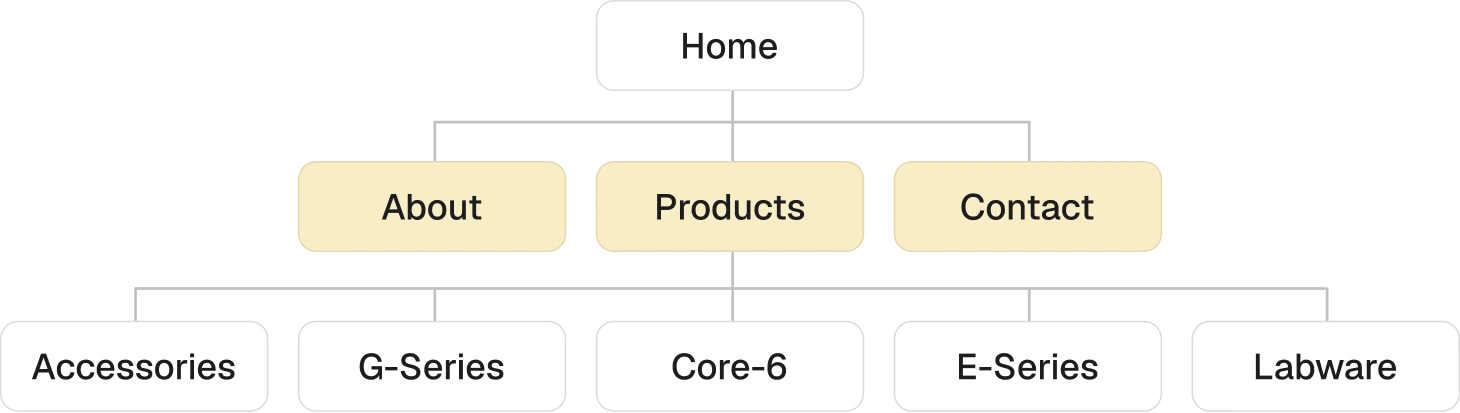
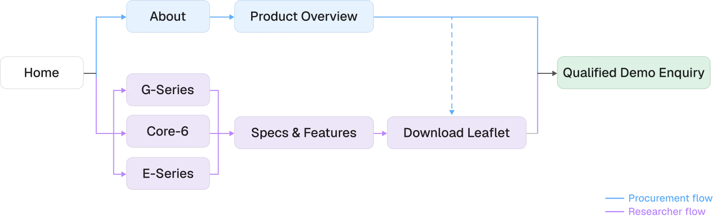
The research showed that technical and commercial buyers needed different levels of information, not separate websites. I structured the experience around a shared journey from product discovery to technical evaluation and demo.
Simplified Sitemap
User Flow
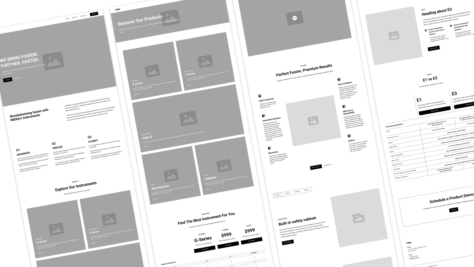
WIREFRAMING
Testing the structure before design
With the structure defined, I used wireframes to map how buyers would move from Nieka’s proposition into product discovery, technical evaluation and a demo.
I focused on:
Clear product discovery
Consistent product comparison
Progressive technical depth
A clear route to demo
The wireframes helped establish the hierarchy of the experience before applying the final visual system.
DESIGN DIRECTION
Building a product-led scientific identity
With the hierarchy established, I developed a visual system that gave Nieka’s instruments greater presence while keeping technical information clear and consistent.
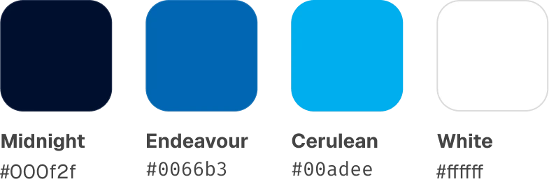
I slightly updated the colours of the recognisable logo and introduced:
A dark, high-contrast interface to foreground the products
Distinctive headings and readable technical typography
A focused blue palette associated with science and precision
Reusable components across product, feature and demo sections
The resulting system positioned Nieka as a focused, modern engineering company without sacrificing usability or technical credibility.
Logo
Colour Palette

FINAL DESIGN
Turning Research Into A Clearer Buying Decision
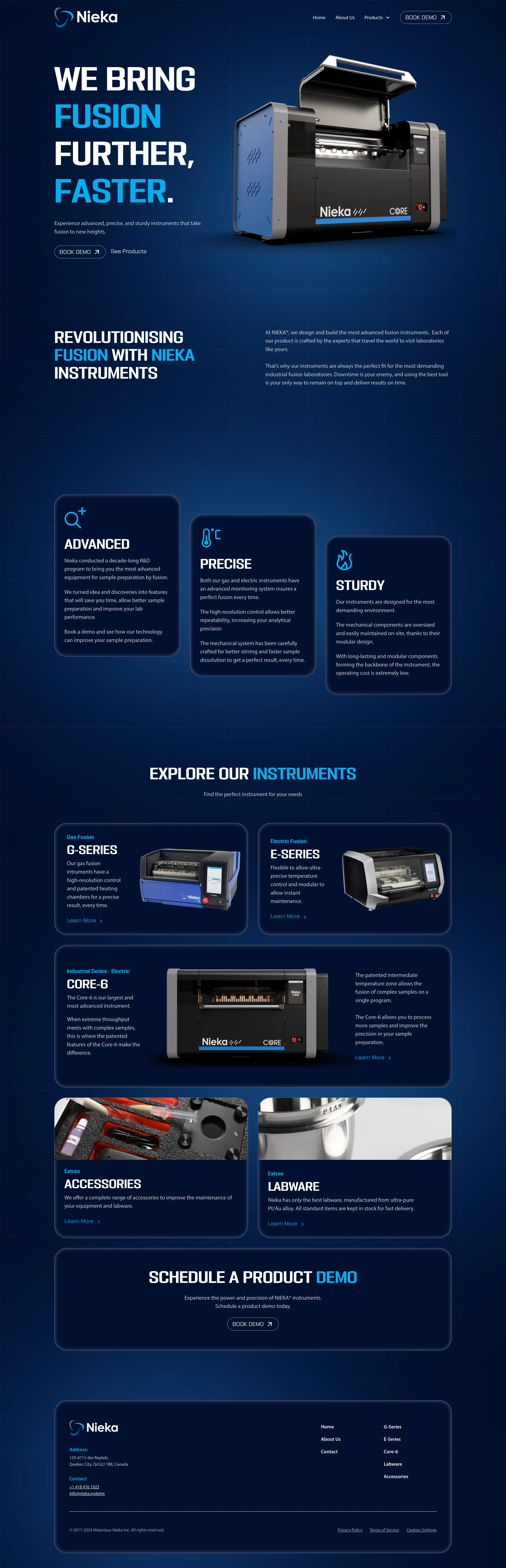
The final interface translated the research into a product-led experience that helped buyers discover the range, evaluate technical fit and progress confidently to a demo.
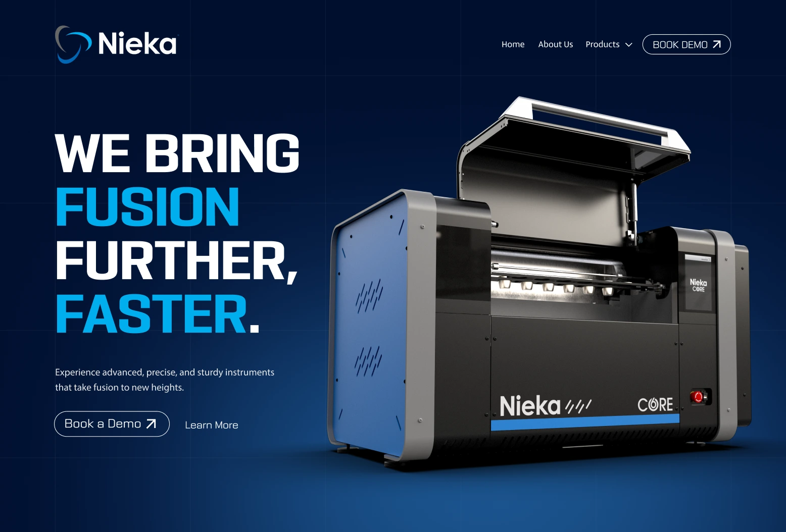
01. A Clear Route To Demo
Consistent calls to action gave buyers an obvious next step once they were ready to enquire.
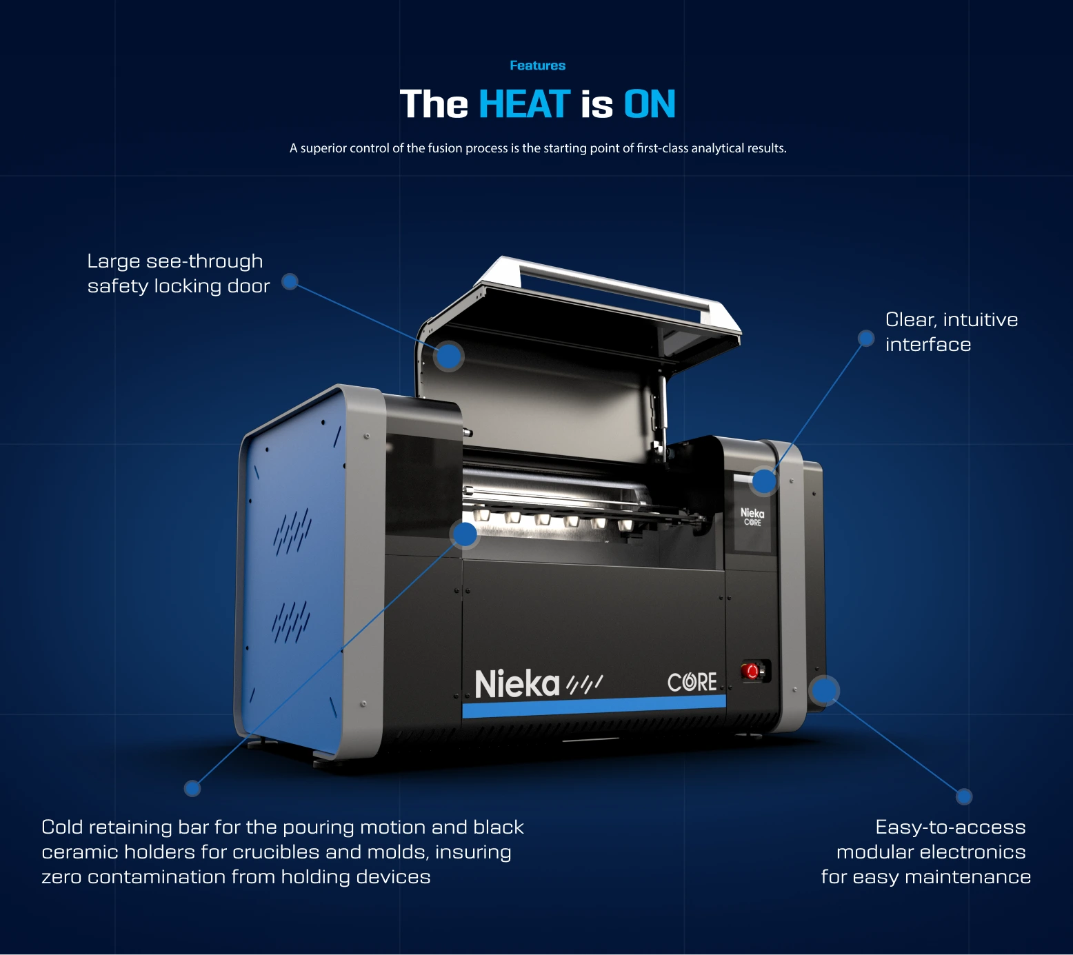
02. Technical Validation
Annotated graphics and structured content helped explain complex engineering more clearly.
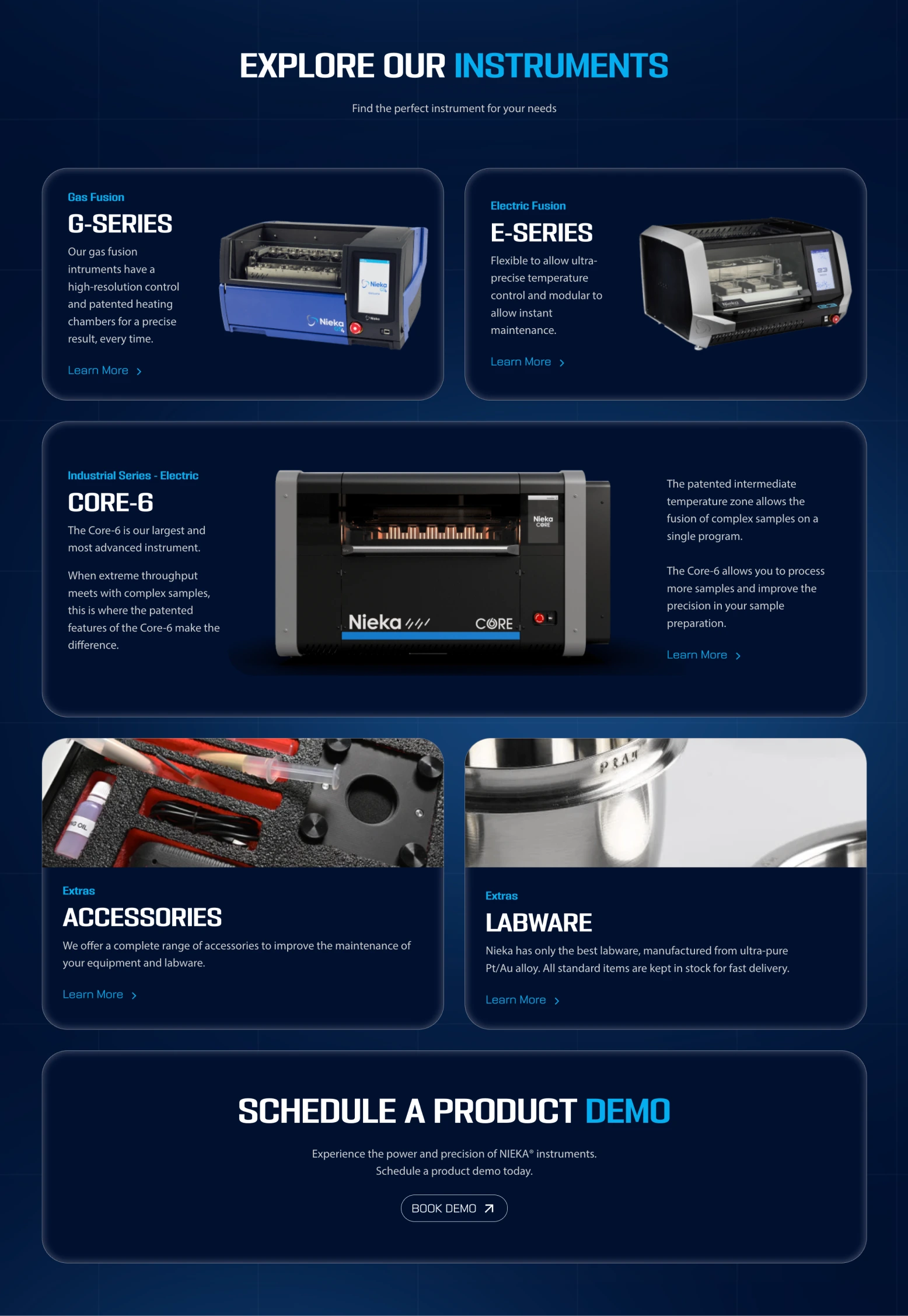
03. Clear Product Discovery
A dedicated product overview made the full instrument range easier to understand at a glance.
IMPLEMENTATION
Carrying the design from Figma into Webflow
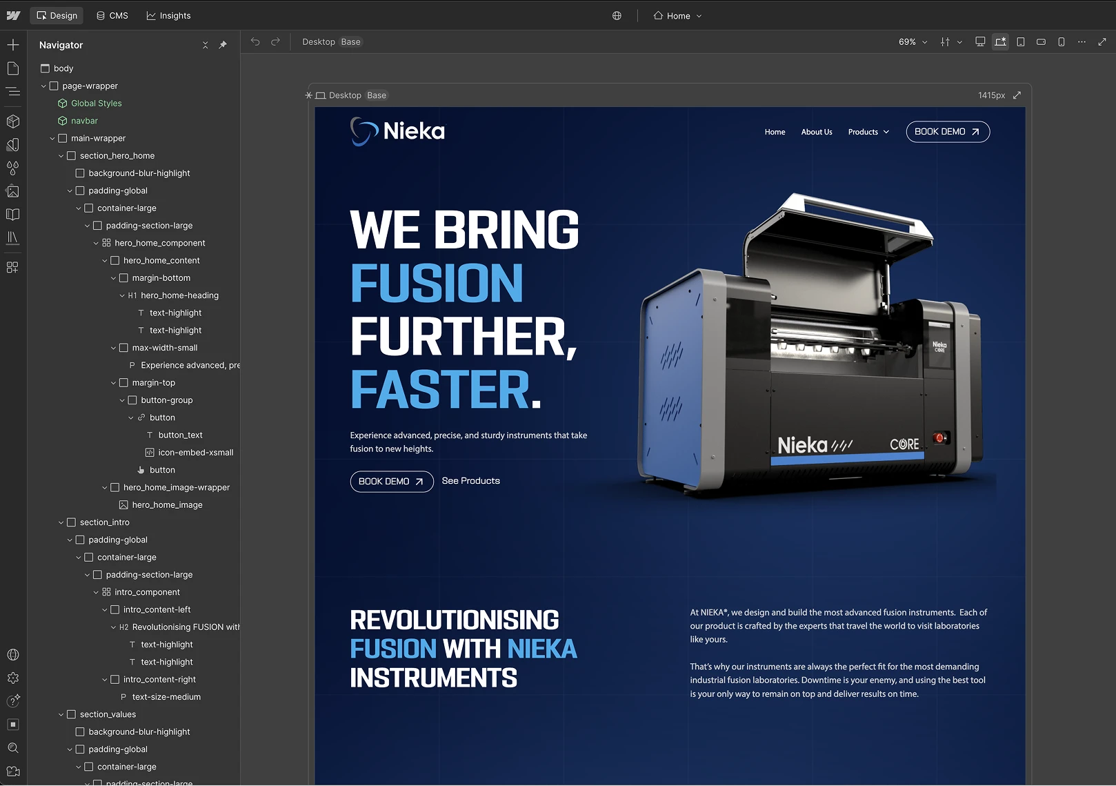
I built the responsive website in Webflow, translating the approved visual system into reusable structures for product cards, technical feature sections, literature downloads and demo calls to action.
Building the final experience allowed me to refine responsive behaviour, preserve the intended hierarchy and create a system that could support future products and content.
REVIEW & QA
Refining the experience before launch
The website was reviewed with Nieka’s founder and product stakeholders to confirm that product distinctions remained accurate and technical information was presented clearly.
Before launch, I also checked the experience across breakpoints and browsers, focusing on readability, interaction states, content hierarchy and form usability.
Stakeholder Review
Verified technical accuracy and product positioning.
Responsive QA
Reviewed layouts across desktop, tablet and mobile
Accessibility Checks
Checked contrast, readability, structure, focus states and alt text.
Functional Testing
Tested navigation, downloads, forms and demo routes.
RESULT
From a fragmented website to a focused product platform
The redesign gave Nieka a clearer and more credible way to present its instruments to technical and commercial buyers.
A clear overview of the complete instrument range
Consistent structures across G-Series, E-Series and Core-6
More accessible presentation of technical information
Visual explanations of complex engineering features
One recognisable route to product literature and demos
A reusable responsive system across web and sales collateral
Before
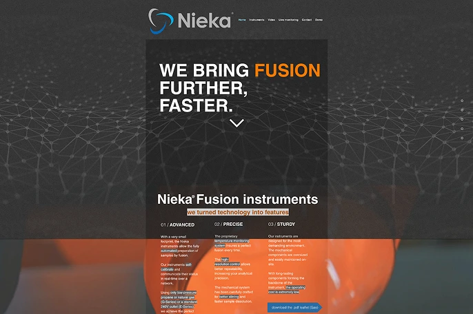
After
“Working with Alex was effective and fruitful. He listened carefully, outlined our needs and delivered a great website!”
SELECTED WORK
Other Case Studies
OPEN TO UX/UI OPPORTUNITIES